A professional website is one of the best ways to demonstrate your skills and experience online. Job-seekers, entrepreneurs, and established industry professionals can all benefit from having a personal website that stands out to potential clients, employers, or collaborators.
When you start designing your personal website, you’ll need to give it some planning and thought to make it as impressive as possible. Use these six tips when building your online resumé or portfolio to create your ultimate personal website.

1. Market yourself and your achievements
No one knows you better than you, which means no one is better equipped to market yourself to potential collaborators or employers than you. Marketing yourself is like selling a product or service, it starts with an elevator pitch. You may focus on pitching your impressive portfolio of past work, or highlight prestigious jobs and internships you have had. Whatever you think your strongest asset is, your elevator pitch should focus on that element so it shines through on your website.
Advait.xyz is a good example of this tip, as Advait Ubhayakar built his website around his impressive qualifications. Advait has both an MBA in Communication Management and an MFA in Creative Writing. He shares this impressive educational background front and center on the homepage, putting it as the main focus of his portfolio for potential employers. As a business consultant, he has worked with a number of global corporations and growing start-ups. This experience is another powerful selling tool for potential new employers, which is why Advait features each company’s logo to highlight how impressive his resume is through brand association.
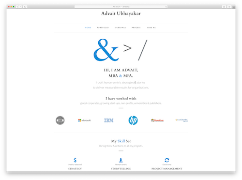
Advait.xyz functions as a sales pitch for Advait’s services and has a proven track record.
“Within a month of going live, it got me an interview for my first full-time copy-writing job for an ad agency in the U.S.,” says Advait, “And in the three years since then, it continues to bring me exciting new opportunities to work on creative writing projects from around the world.”
You can follow this same principle with your professional website. Create a 30-second pitch about yourself and pay attention to what you mention at the start. No matter what level of experience you have, you can still make your best qualities and skills the focus of your portfolio. Those traits should be the core of your professional website’s overall pitch to visitors, as it highlights what you can offer to a potential employer or partner.

2. Structure your site around your work
Once you have hooked your audience with your homepage, you will want to explain your abilities in further detail. A great way to do this is by creating additional pages for the projects and achievements that you have worked on. This may include professional experience, education and academic achievements, awards and accomplishments, training and certifications, or other projects relevant to your desired job. Structure the layout of your website so that it’s easy to navigate through your work.
Award-winning writer and journalist Melissa Hung shares her portfolio on her personal website, MelissaHung.xyz. Melissa’s outstanding work and admirable experience are organized neatly on three main pages. You can view the stories she’s written for publications like Vogue and Catapult under Essays. Head to Journalism to read her San Francisco Chronicle and NBC News features. Under Editing you will find information about the many books she helped develop and line edit, as well as the magazine where she held the highest-ranking editorial title of Editor-in-Chief. On her About page, she lists notable press she’s received as well as prestigious accomplishments like being awarded a White House National Arts and Humanities Youth Program Award.
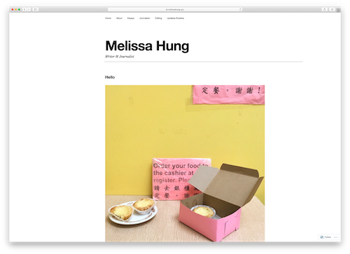
All of the pages Melissa has on her website are purposefully laid out to be simple and contain little extra content that would take the focus from her writing. This puts the focus on the pages that do feature her work and avoids creating distractions for visitors to get lost in.
Whatever aspect of your work you choose as the centerpiece of your website, remember to create a site navigation that guides visitors toward it. This makes your chosen skill the main focus of your site, and uses that skill to illustrate your full abilities and the true quality of your portfolio.

3. Communicate your message clearly and concisely
Time is precious for your potential clients and employers, so it’s important to communicate your core beliefs and mission as effectively as possible. If you can, make use of recognizable companies and people you may have worked with. You may also want to consider sharing some data and metrics that prove the success of your past projects. This type of language will get their attention and increase your chances of sticking in their minds.
Esteemed business professional and author Juan José Delgado shares his personal website on JJDelgado.xyz. On the homepage, JJ welcomes website visitors with an eye-catching description of himself: The leader behind the biggest sales day in Amazon history. With a PhD in Digital Economy and Online Human Behavior, and over 12 years of business experience at well-known brands across Europe and Latin America, JJ could have described himself in many impressive ways. To make the most immediate impact on visitors, he chose to lead with a powerful statement that references e-commerce behemoth Amazon.
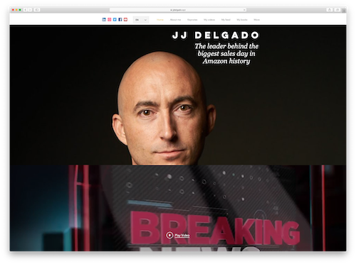
Further description of JJ on JJDelgado.xyz mentions his status as one of LinkedIn’s Top 15 Influencers of 2018 and Top 50 Worldwide Human Behavior Experts to Follow in 2017. This reference to yet another recognized brand and inclusion in these rankings further prove his notoriety in his field.
Employers and potential collaborators are coming to your website to learn more about you and what you offer. When you convey that information clearly and concisely on your website, you increase the chances those visitors will identify with your personal message and want to work with you.

4. Make a visual impact
Countless social media and other online platforms prioritize video and pictures over all other content. This is an indicator that images and video are more engaging. Using eye-catching imagery on your website is a quick and effective way to draw visitors into your page and get them interested in you. This could mean using a rotating slideshow of past projects, sharing business logos when listing the companies you’ve worked for, and sharing a professional photo of yourself with your description.
Video game character designer Soa Lee has crafted many beautiful characters for the popular game company Naughty Dog Games, including characters in the newly released and highly anticipated The Last of Us Part II. Her personal website, SoaLee.xyz, prominently features these amazing designs. Soa uses both video and images to showcase her work as if it were a digital photobook.
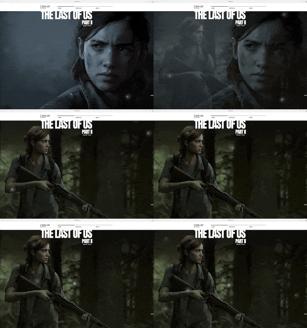
Soa’s strategy of including vivid imagery of her work is effective. She explains “My career and fame as a 3D artist have been growing with my personal website. Now, my website has become the most important way I spread awareness about myself.”
When you can, try to show your skills and past work through well-placed pictures and video. This will grab visitors’ attention and keep them on your page. It’s also a clever way to draw visitors’ eyes to specific blocks of text on your site you want them to read.

5. Keep your target niche or market in mind
Creating your website with your target audience in mind helps you focus your design choices to better appeal to that specific group. It helps you attract collaborators or employers who best match your interests and skills. Whether you’re a musician looking to find collaborators in a certain genre, a writer pursuing stories in a specific field, or a trained professional looking for a job in a certain industry, your website should appeal directly to others in that same niche.
One great example of this in action is JovelRoystan.xyz, personal website of an ASOS fashion executive. Jovel created his personal site to share his thoughts on fashion, music, and lifestyle to “all the ambitious twenty-somethings who desire more than 9-to-5s and Netflix.”
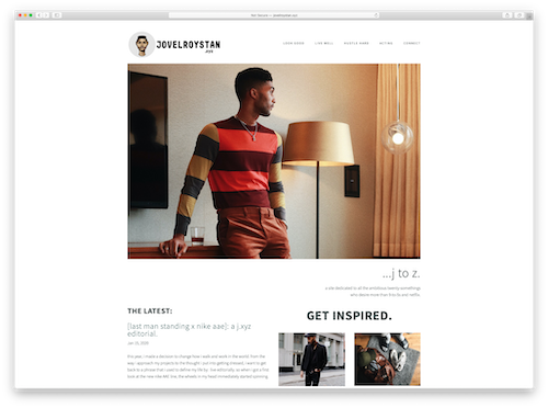
He makes frequent use of aesthetic photos showing his personal style and the places he’s visited to appeal to young professionals who dream of a similar lifestyle. He utilizes his blog to offer his thoughts on music, fashion, his industry, and current events that are relevant to his audience. All of this creates a unique style on the website and puts forth an image that will appeal to others who think and hustle like him.
Work backwards from who you want to visit your site, then build it to appeal directly to that group. This helps you maximize your reach to your specific audience and increase your influence in your target market, like Jovel did.

6. Paint a full picture of yourself
Think for a moment of the many different skills you have. When your website reflects your full range of abilities, you give a more complete picture of what you can do to potential collaborators, employers, and clients. You might have lived in a unique place, possess a special skill, or come from a specific background that adds depth to your experience. Displaying that part of yourself on your professional website lets employers and collaborators understand you better and helps them visualize how you can fit into the culture of their company.
Multitalented professional Karen Wang has many capabilities, from writing to UX design to teaching yoga and mindfulness. On her portfolio website, KarenJWang.xyz, she showcases each of her skills to paint a full picture of herself to visitors. Karen does this through her website design by using three tabs at the top of the site corresponding to the three main skill areas of her life: Work, Art, and Wellness.
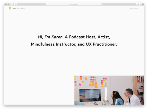
With KarenJWang.xyz, Karen hopes to inspire others to pursue their hobbies and interests outside of their career.
“Creating a website that showcases my eclectic interests has always been a priority of mine. Besides being an aspiring UX designer, my free time consists of cooking vegan meals, teaching vinyasa yoga, dancing, blogging for music festivals, and lots of time for being silly.”
Your personal website can be about more than just your professional accomplishments. Include the skills and passions you have outside your professional life to make your personal website have a more human feel. This can show potential employers you can be both a work and culture fit for their business.
Conclusion
In summary, if you want a great portfolio website that will stick in the minds of your website visitors, then make your design choices carefully so you highlight your work in the most efficient way. Show the full scope of what you can do and inspire your website visitors with your exceptional words and creations. Use your website design to accentuate the best parts of your portfolio and present what you do clearly and concisely. Remember to paint a complete picture of yourself so that site visitors see the “professional” you and feel like they’ve met the “personal” you as well.
These tips will help you make a website that is memorable and presents you in the best light to the potential employers or collaborators you want to reach. Your personal website is a way for you to express yourself in all your creativity, complexity, and fullness to potential collaborators and employers. Put your best foot forward using an inspired design like these .xyz adopters.


