
The Beginners Guide to Building a Managed WordPress Website: Part 1
Get started building your first WordPress site with our easy to follow step by step guide.

Just bought your Managed WordPress package and wondering how to get started? This guide is for you. Rebel's Managed WordPress packages offer quick speeds, and take the headache out of running a WordPress site. We automatically install your free SSL certificates (and renew them) and automatically update your WordPress, Themes, and Plugins. The packages come with WordPress pre-installed, and includes email, security and malware scanning. We also pre-install the Elementor Website Builder plugin, so you can build a great looking website without in depth WordPress experience.
But having a hosting package and a WordPress installation isn't the whole story, for some people the next step can be intimidating: how do you start with a blank WordPress installation and create a website that you're proud to show off to all your friends, visitors and customers?
In this guide, we will cover how to build a website using the Astra theme and the Elementor toolkit, along with the built-in power and performance of WordPress. In Part 2, we will also cover how to make your site easy to find on Google, how to keep it safe from hackers, how to make sure it looks good on mobile, and how to make sure it's lightning-fast.
Table of Contents
- Astra: Free themes and Starter templates
- Building the Header
- Page Building with Elementor
- Rebel Website Design
Astra: Free Themes and Starter Templates

You will first need a theme. Astra is a powerful, light-weight, and easy-to-use WordPress theme that's been used by over 700,000+ users. And the best part? It's free.
Some of the benefits of Astra are:
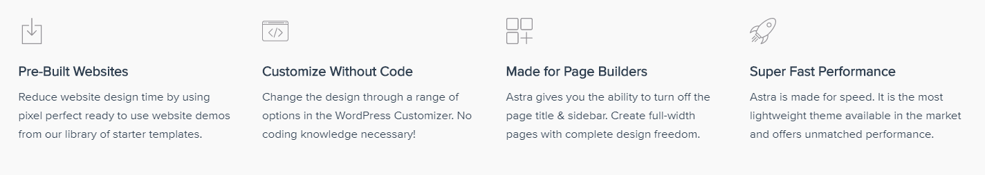
Not only will your website be fast, but you will be able to make it look exactly how you want with Astra's visual theme customizer.
Largest Library of Pre-Built Websites
Take a look at these gorgeous websites made with Astra and various Page Builders. These are available for import with Astra Sites plugin.
You can use any theme you'd like when starting your new website, but Astra is a terrific option and a great place to start. The next steps in this guide will presume you're using Astra as your theme.
Installing the Astra Theme
Astra is a free WordPress theme. Therefore, it can be installed and used like any other.
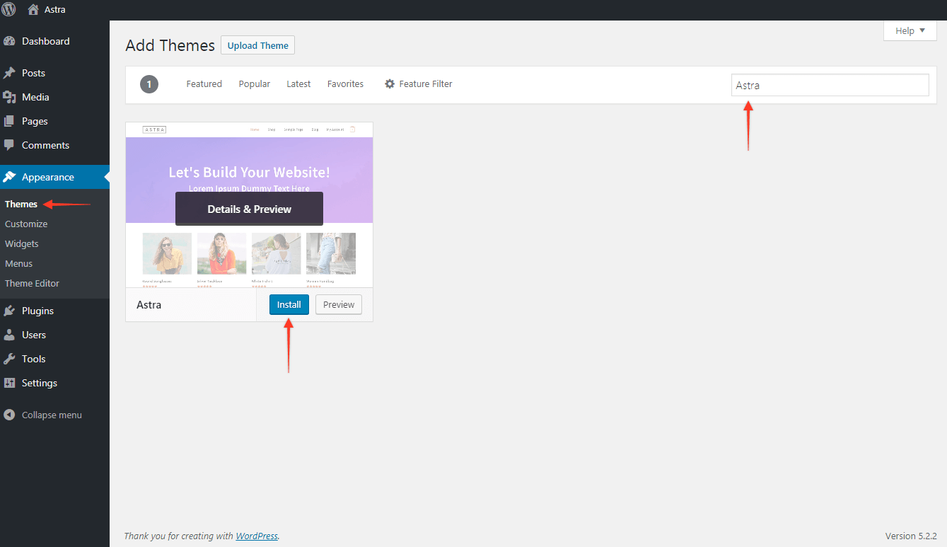
To install it on your site, follow these steps:
- Login to your WordPress Dashboard.
- Go to Appearance > Themes > Add New
- Search for - Astra
- Install Astra
- Activate it
Note: If you need the zip file of Astra theme, you can download it from the WordPress Repository here.
Working with Starter Templates
Astra provides a stunning library of pre-built templates. Instead of designing a website from scratch ,you can import Starter Templates (formerly Astra Starter Sites) with few clicks and customize them in your own way.
Starter Templates are available with all page-builders, including our recommended page-builder, Elementor.
Starter Templates library has a number of templates, some are FREE (without any tag) while some are marked with AGENCY tag.
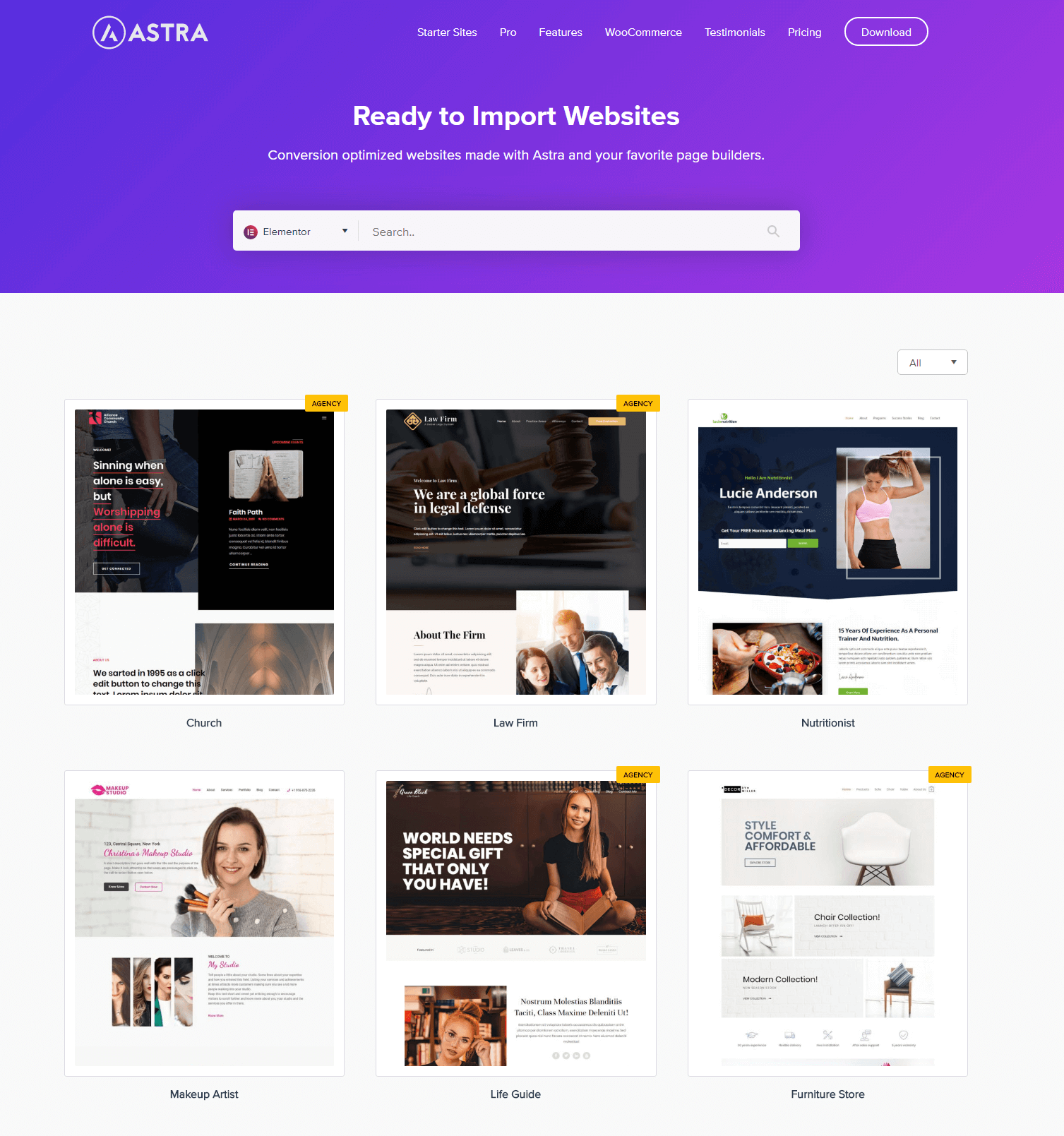
Starter Templates that do not have any tag are available for free. These templates are created with free versions of page builders (Elementor, Beaver Builder, Brizy) and free external plugins.
The Starter Templates plugin is available in free as well as premium versions.
Here is how you can install a free version of this plugin:
Step 1 - From your WordPress dashboard, visit Plugins > Add New and search for a plugin 'Starter Templates'.
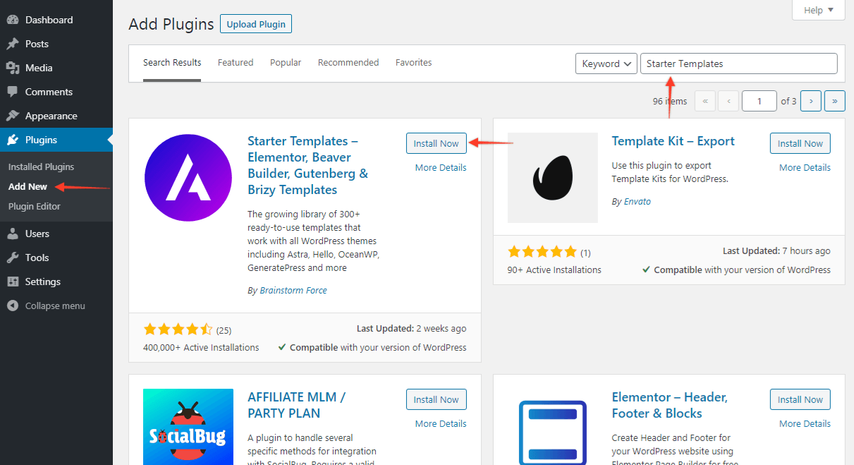
Step 2 - Choose to install the plugin and activate it.
Step 3 - Find plugin settings under Appearance > Starter Templates.
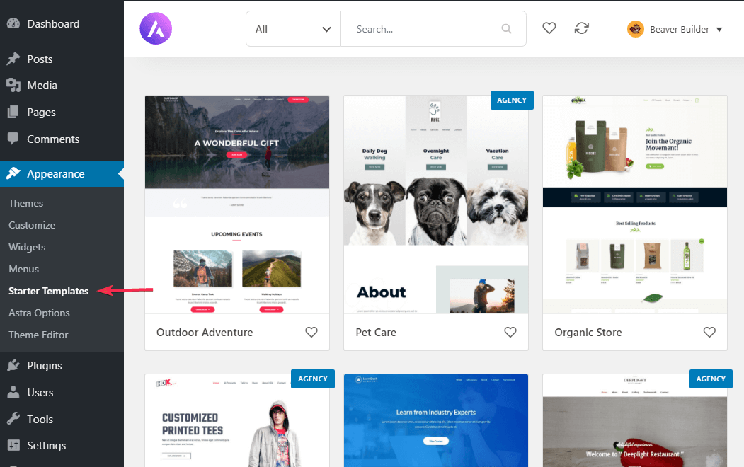
Import a Starter Template
The Starter Templates plugin allows importing the entire site and as well as single-page templates. Sometimes you might have a website with some content on it already, like pages, posts, customizer settings, etc.
Importing Single Page Template will not affect anything on your website. This will create a new page as a draft in the page list. So even if you import a number of pages, it will not affect your existing website.
Importing Complete Site Template on the existing site that already has content, might affect the look of the site. Newly imported content will get mixed with the existing one and it will display unexpected results.
While importing a complete site, a popup displays few options. In case you want to skip any of the parts of the site you can choose options accordingly.
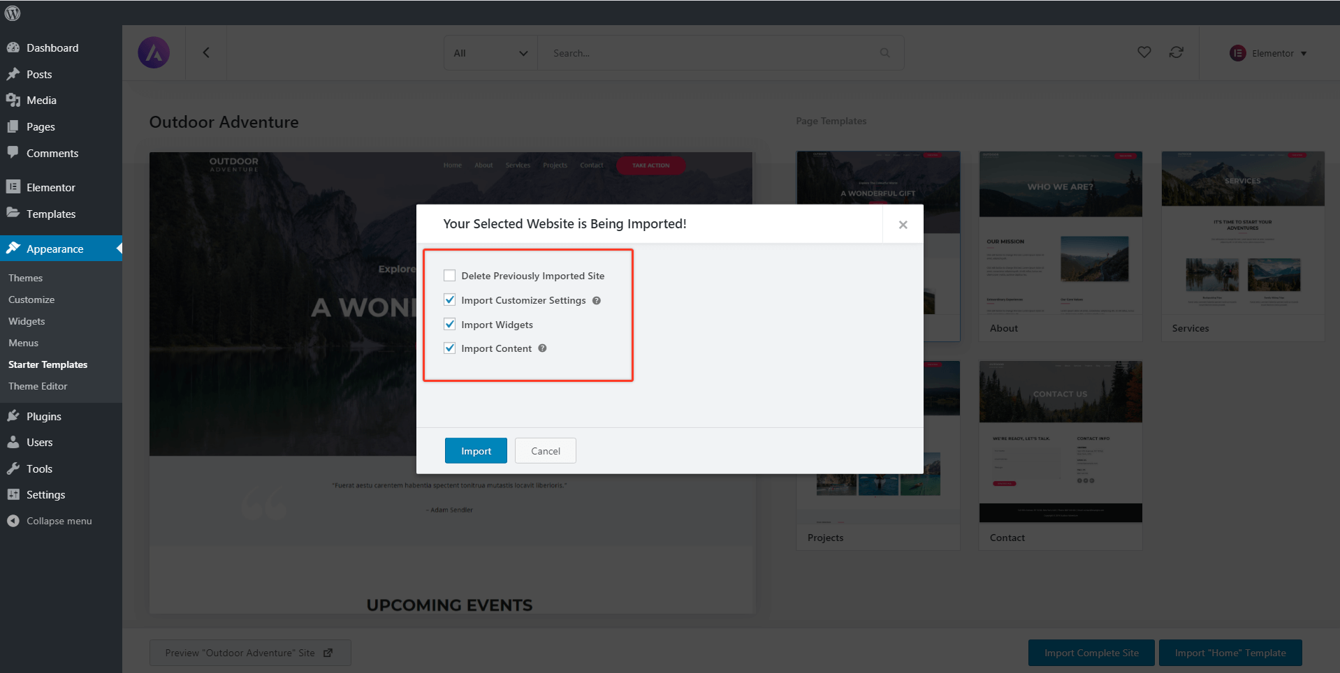
We recommend taking a backup of your existing website before making any major changes. It's easy and takes only a few minutes.
Building the Header
Astra comes with several built-in header layouts that allows you to create an impressive header section. You can easily design a Sticky Header, a Transparent Header and add some extra sections to with add-ons. Astra Pro allows you to add custom headers where you can design with any page builder.
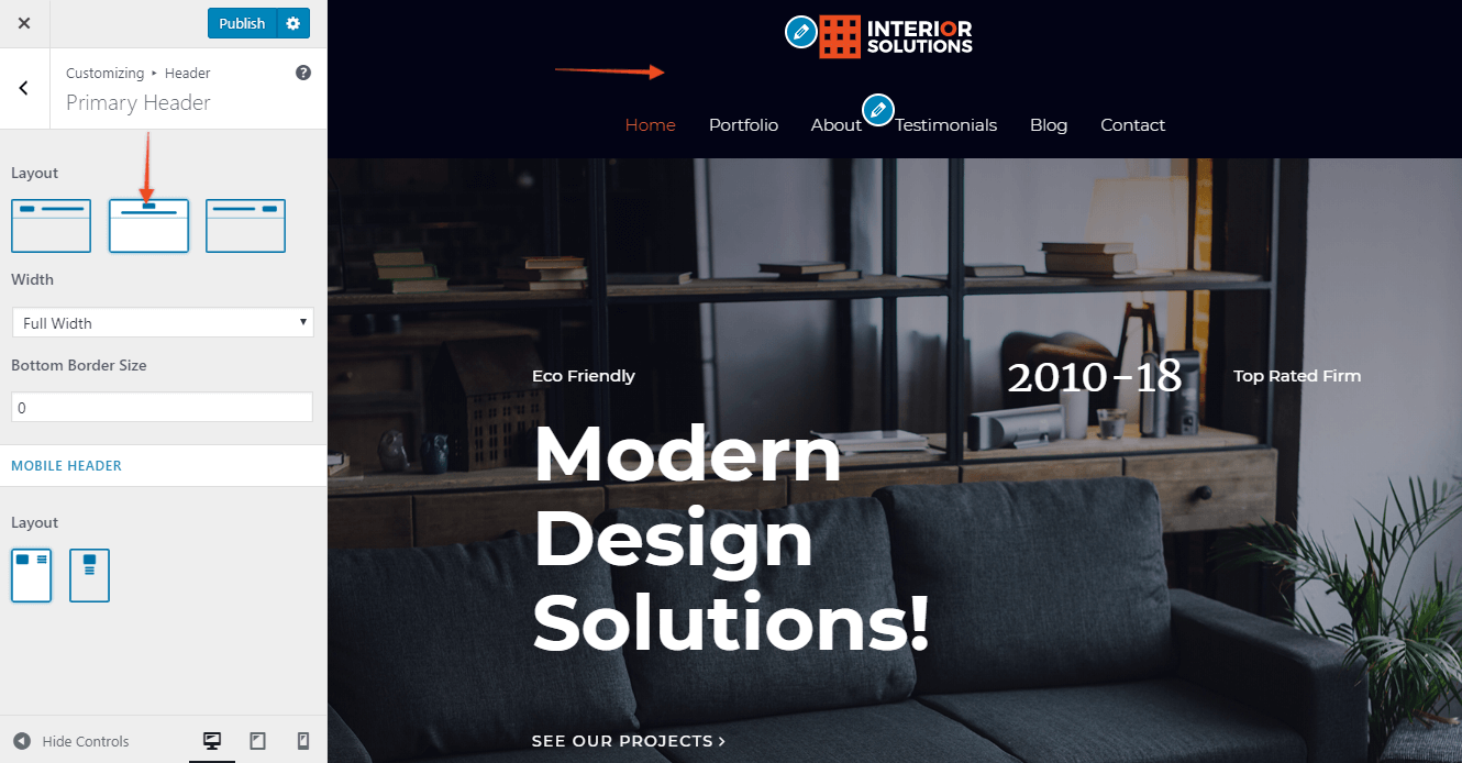
Primary Header
Primary Header is a default Astra header. It will display a logo and a primary navigation menu. This header can be customized with the following options available in customizer under Header > Primary Header.
Layout
This setting will give three different positions for the logo in the header.
- Logo Left - Logo will display left to the menu. This is a widely used header style.
- Logo Center - Logo will be placed above the menu in the center. If you have a long menu you can opt for this layout.
- Logo Right - Logo will be placed at the right of the menu.
Width
This allows you to set header width either to full width or to the content width.
- Full Width - This will stretch the header content to both ends according to your browser size.
- Content Width - It will set the content of the header to container width set under Global > Container > Width.
Border
It will add a nice border at the bottom of the header. You can choose a width and color for this border.
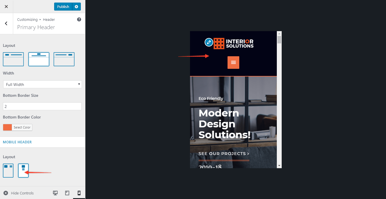
Mobile Header - Layout
On responsive devices, the menu converts into a hamburger menu. In the primary header, on responsive devices, only the logo and hamburger menu will display. You can manage the position of the logo with respect to the hamburger menu.
In case you have a big logo you can opt for Stack where hamburger will display below the logo. Otherwise, Inline menu and logo will look fine with a small logo.
Color and Typography for Primary Header
With the Astra theme, global colors and typography set for the entire website will be applied to the primary header automatically. If you are looking for header-specific color/typography settings, they are available with Astra Pro Add-on plugin.
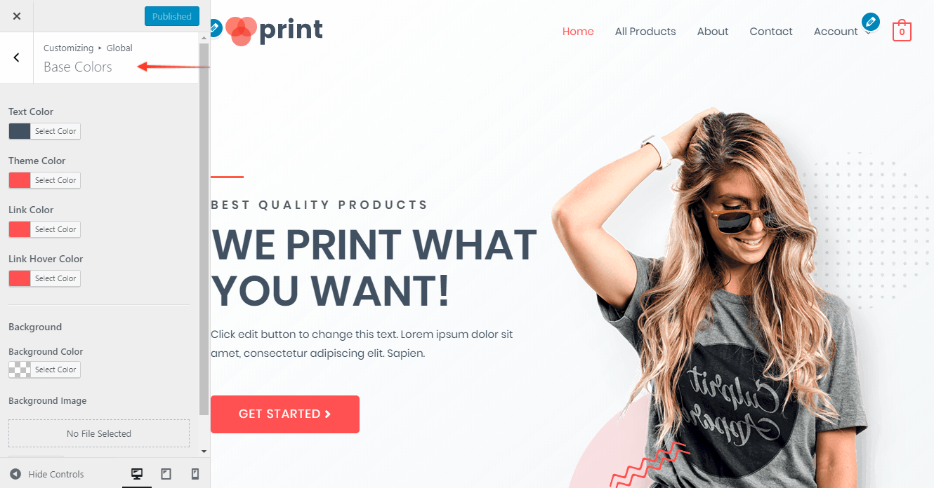
Primary Header Colors with Astra Theme
As mentioned above, global colors available under Appearance > Customize > Global > Colors will be applied to the header, while with the Astra Pro Add-on you get an option to set a color for each element in the header.
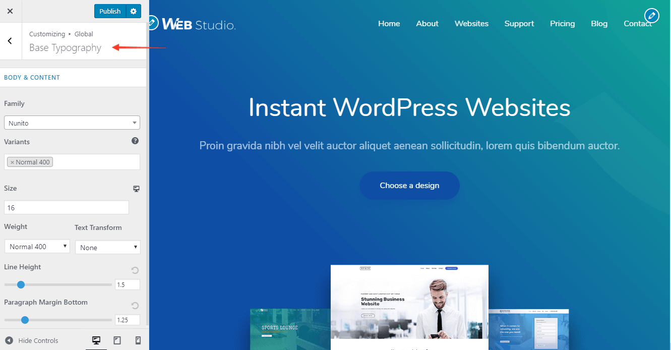
Primary Header Typography with Astra Theme
Typography set for the site under Appearance > Customize > Global > Typography will be applied to the header content by default, while the Astra Pro Add-on provides more specific options.
Transparent Header
Quick Steps on How to Add a Transparent Header on Your Website
Step 1: Find the Transparent Header Options under the customizer [ Appearance > Customize > Header > Transparent Header ] to edit Transparent Header Options.
Step 2: Under the Transparent Header section you can enable it on a complete website, set a different logo, and add a Border Bottom color.
How Does Transparent Header Work?
Transparent Header allows you to easily create beautiful and attractive headers. Enabling this option will set your primary header background to transparent and pull the page content to the top. It will merge the primary header and the page's content. That means your top part of the page content will be set as a background to the transparent header.
For example, if the page contains an image as a top section, it will be pulled up and set as a background image for the transparent header.
Layout settings for Transparent Header
After updating the Astra theme to version 1.6.0 and above, Transparent Header settings will be available in the customizer. From the WordPress dashboard navigate to Appearance > Customize > Header > Transparent Header. Below are the available options.
Enable on Complete Website
Tick the checkbox for this option if you wish to display a transparent header on the entire website. When you enable this option, it offers the following exclusion rules. That means you can choose some pages and posts, where the transparent header can be disabled.
- Disable on 404, Search & Archives: This setting is generally not recommended on special pages such as archive, search, 404, etc. If you would like to disable the transparent header on these pages, tick the checkbox.
- Disable on Blog Index page: From Homepage Settings, if you have set Your homepage displays > Your latest posts then the front page becomes a Blog Index page. If you would like to disable the transparent header on it, tick the checkbox.
- Disable on Pages: If you wish to disable the transparent header on all pages, tick the checkbox.
- Disable on Posts: If you wish to disable the transparent header on all posts, tick the checkbox.
Note: Transparent Header can be set from Page Meta settings as well. Just Edit the page/post, in the right sidebar, and you will find the Astra Settings section. This allows you to enable/disable transparent header for particular page/post. Note that the page meta setting has higher priority than a customizer setting.
Enable On
Choose a device to display a transparent header. Options are -
- Desktop
- Mobile
- Desktop + Mobile
Styling
- Different Logo for Transparent Header: When you enable transparent header, by default it displays the site logo set under Layout > Header > Site Identity. If you wish to set a different logo that site logo on the transparent header, tick the checkbox and set a logo.
- Bottom Border Size and Color: Set a bottom border for a transparent header.

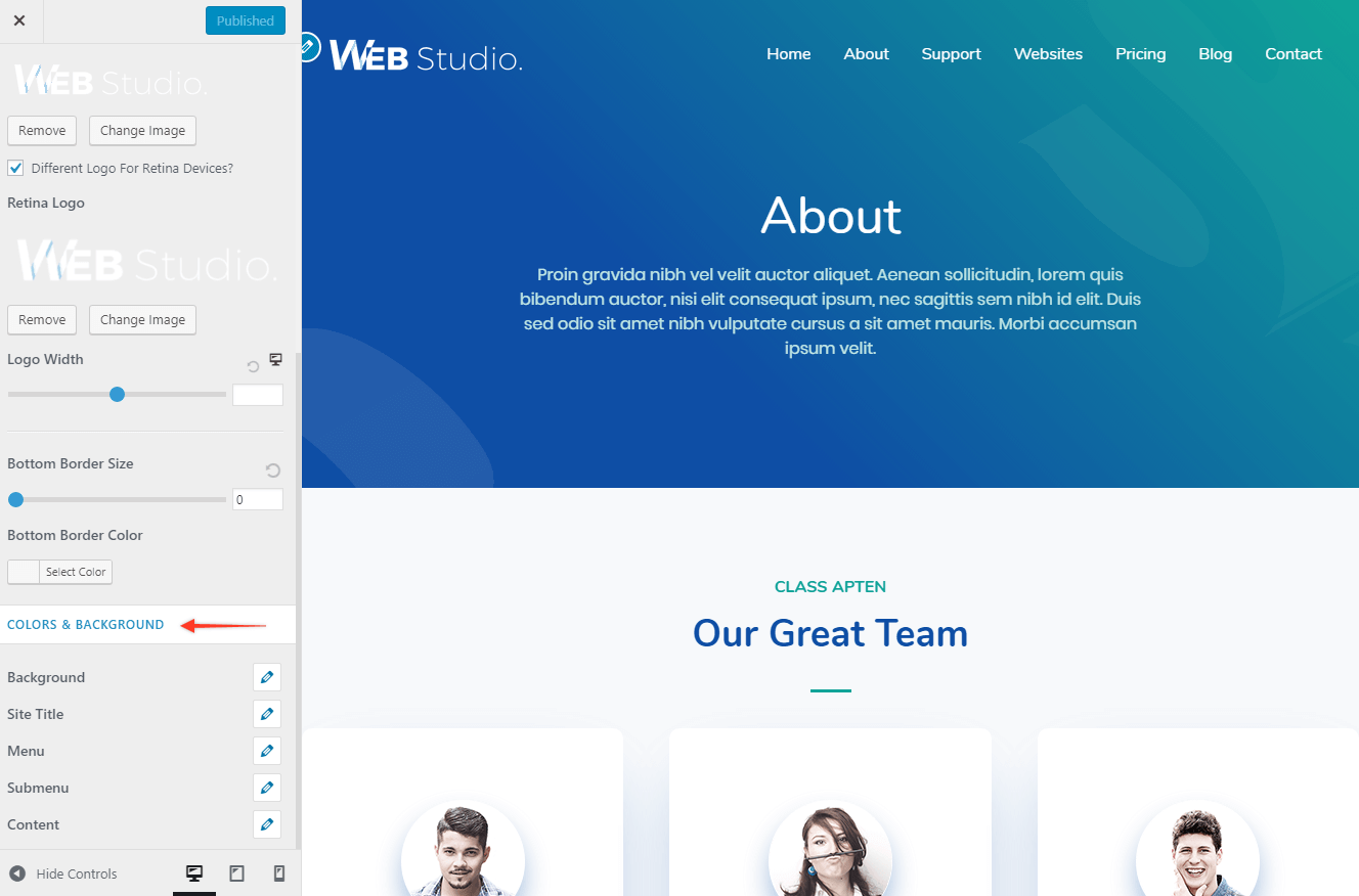
Colors & Background for Transparent Header
Settings are available in the customizer under Header > Transparent Header. Set different colors for a transparent header with the following options -
- Background - Background Color of the Transparent Header
- Site Title - Site Title Color
- Menu - Background Color, Link / Text Color, Link Active / Hover Color
- Submenu - Background Color , Link / Text Color ,Link Active / Hover Color
- Content - Text Color, Link Color, Link Hover Color
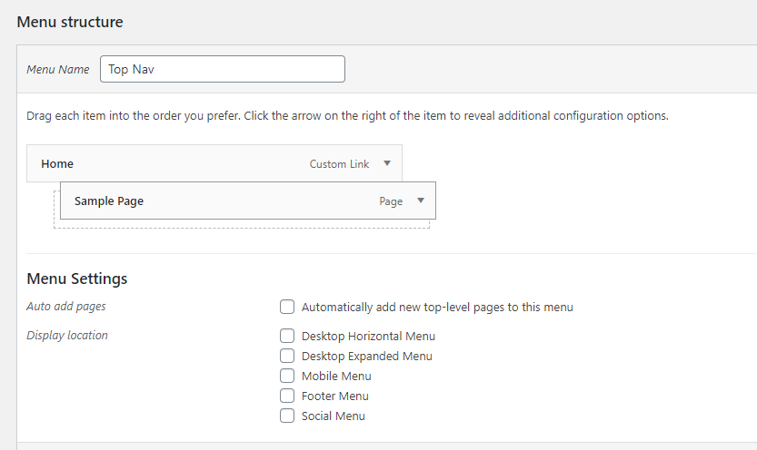
Create a Menu
Create a Menu
- In your WordPress dashboard click Appearance, then Menus.
- If your theme already has a default/primary menu, you can click on it to begin editing.
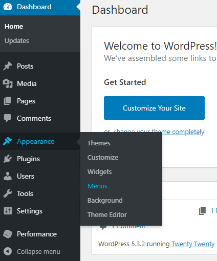
- Give your menu a name.
- If your theme does not already have a default or primary menu, click Create New Menu.
- Add menu items from the column on the left (note that any pages you've created will appear on the left, sorted by Most Recent and View All).
- Select where you want the menu to appear (your options will depend on your theme).
- Click Save Menu to save your changes.
Add Menu Items
In addition to pages you have already published, you can add several different types of menu items to your custom menu. The most common are:
- Pages - a link to another page on your site
- Posts - a blog post on your site
- Custom Link - a custom URL linking to another site
To add one of these menu items:
- Put a check next to the page you want to add, for example: Home.
- Click the Add to Menu button.
- Click Save Menu to save your changes.

Menu Display Location
If you want this menu to display on your site, select a Menu Location. For the main navigation, the correct setting depends on your theme. Often it is listed as Primary, Header, or Top.
If your theme offers a Social Links Menu, it will automatically convert menu items to corresponding icons for popular social media sites.
Automatically Add Pages to your Menu
Under Menu Options, check the "Automatically add new top-level pages to this menu" if you want newly created pages to automatically be added to the menu.
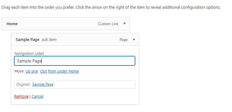
Create Drop-Down Menus
Nesting a page creates a sub-menu or drop-down menu. To add a page or custom link as a sub-menu first add the page to your menu.
- Check the box next to the page you want to add.
- Click Add to Menu.
- Drag the menu item under the page you want it to be a sub-menu of. The sub-menu page will be offset, as shown.
- Click Save Menu to push your changes live.
Customize the Menu Item Text
You can change the name of the menu item as it appears on your site by editing the navigation label. To do so, click on the item in the settings on the left side of the customizer. It will expand and show a field for Navigation Label.
Here, enter the text as you want this menu item to appear on your site:
Page Building with Elementor

Elementor is a page builder plugin that replaces the basic WordPress editor with a live frontend editor, so you can create complex layouts visually, and design your website live, without having to switch between the editor and the preview mode. The page builder enables you to reach a top-notch quality of design without needing to use code or CSS, and without relying on developers for help.
The user interface is extremely friendly, so it only takes a few minutes to get the hang of it. This means, for example, that when you drag and drop widgets, it is done instantly, without any lag time at all.
Adding Your First Page
Start with a template, or design the whole page from scratch. Follow this video to learn how to create your first page fast.
The video above takes you through how to create a new page in WordPress, how to load the Elementor toolset, and how to start adding content.
In WordPress, go to Pages > Add Page
Click Edit with Elementor
The video describes how to set global properties for your site (like changing to a full-width site). The video also shows you how the structure of the site is built.
Sections - Your page is broken into sections, which allows you to have discrete areas of your site that you can style their own way. You can have a header that's one big column, a large background image, and some text, etc, and then a section underneath with 4 columns to break up information in a way that looks terrific. This makes it easy to set properties for one section without changing the whole page, to copy a section, and to click and drag a section to another part of the page.
Columns - Within sections, your site is made up of columns. Even if you only have one space for content that spans the full page, that's one column. Using columns allows you to divide your information and your visual flow in ways that are easy to read and understand for your visitors. For example, you can build a 3 column layout with the middle column being 50%, and the left and right columns 25% each, if that's how you want that section of your site to look. And you can click and drag the columns to resize them.
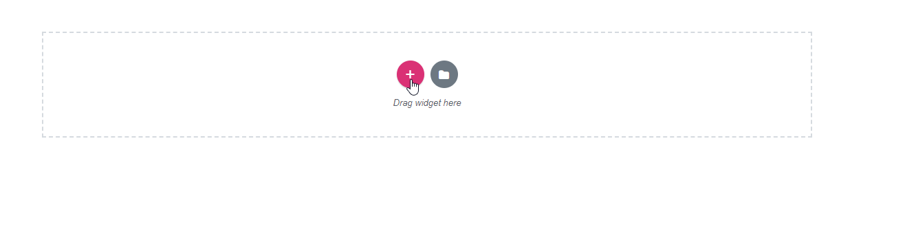
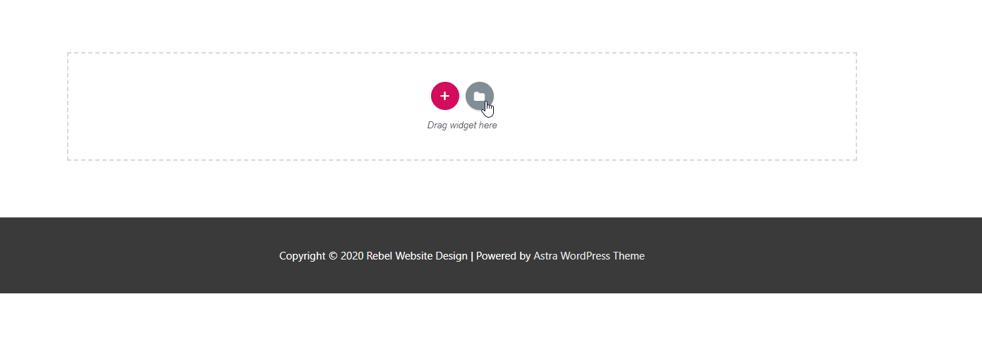
Widgets - Widgets are the individual elements on your site. Headers, text, images, videos, buttons, are all widgets and can be dragged into columns on your page.
The video will show you how to drag a widget onto your page, like a block of text, and then how to change the size, the colour, the typography, the font, etc, all quickly and easily in the editor.
A great way to get started with a new page is to start with a Template; either a Template Page or a Template Block. You can click the Add Template button in the Elementor editor to import an entire model of a page and then edit it with your own content, or just import a block for a pre-designed content section. If you want to add a header but haven't decided how you want it to look, import a header block that looks great and then changes the style to match your vision.
Keep reading for more about creating your first page.
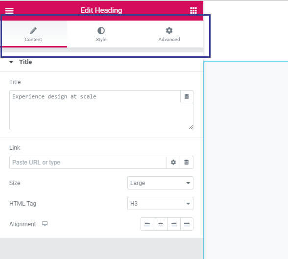
Adding Content
To start working with Elementor you need to create your first page (see the previous page for more info and screenshots), so from the WordPress dashboard go to Pages, click Add New, and give it a name, then click Edit with Elementor.
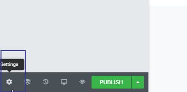
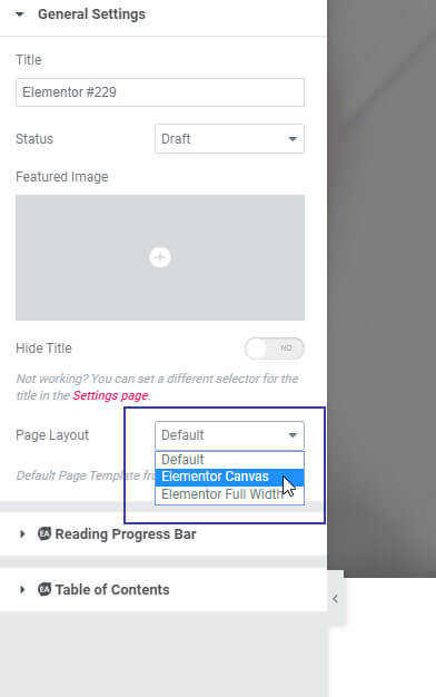
To start with a clean page go to the bottom panel and click the Settings icon.
And for page layout choose Elementor Canvas. This is the easiest way to create a full blank page.
Editor and Widget Areas
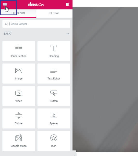
The Elementor interface on the right side is the Editing Area of the page. This is where you can add and edit elements that form the layout of your page. On the left side is the Elementor panel with creative tools called Widgets. You use Widgets to add elements to your page like headings or a text editor, images and videos and much more.
You can always access this area by clicking on the widgets icon on the top right.

And on the top-left, you have a hamburger menu where you have more options like setting default colors and fonts, which saves a lot of time when designing your page.
From the hamburger menu, you can set the default colours and fonts to be used throughout the site. Setting a default doesn't mean you can't change individual fonts as needed, it just ensures that all your text and headers and colours are placed on your page with default settings. So you can set your default font to Roboto, and later you can change an individual element to something else. This is a great way to make sure your site has a consistent look and feel throughout.
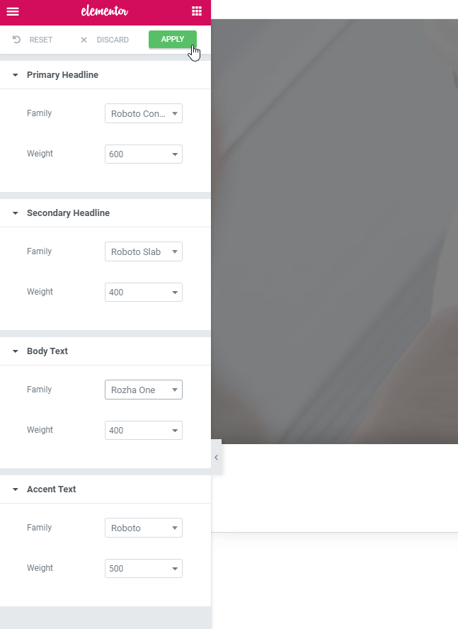
Don't forget to apply your changes!
Back in the hamburger menu, you can also click View Page to see your live website, or Exit to Dashboard to go back to your WordPress dashboard.
At the bottom is another panel with more key features such as Settings where you can give the page a name and choose a page layout.
Note the Navigator, which helps you get a clear and organized view of your page.
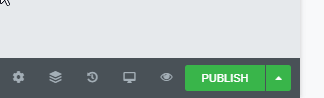
You can also see the Page History to view recent changes, and next to it is the responsive menu for switching between screen modes. You can preview your changes and when ready to go live simply hit the publish button.
Building Content
There are two ways you can start. You can use the library to preview Elementor's pre-made blocks and pages, as well as your own templates, and insert them into your page. We'll cover that in the next section.
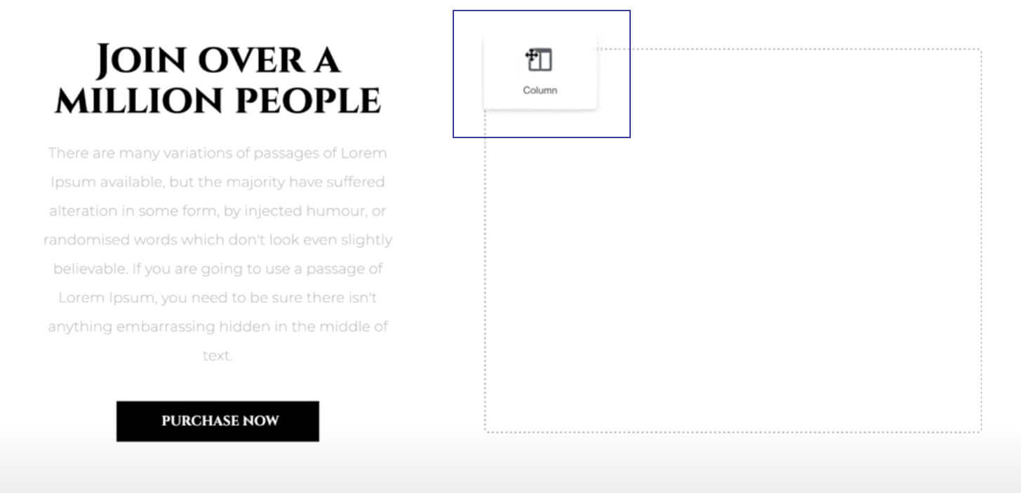
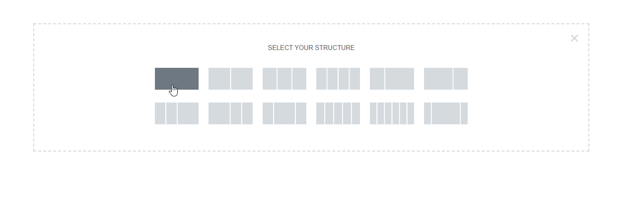
Elementor uses three main building blocks: sections, columns, and widgets.
Sections are the largest and can be identified by their blue border.
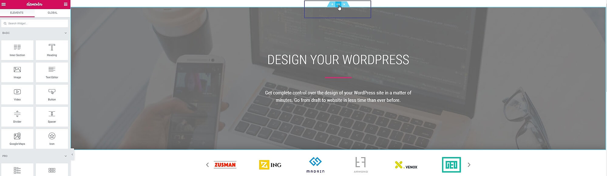
Inside them are columns. You can identify them by the black dashed border. These columns house widgets such as text and buttons.

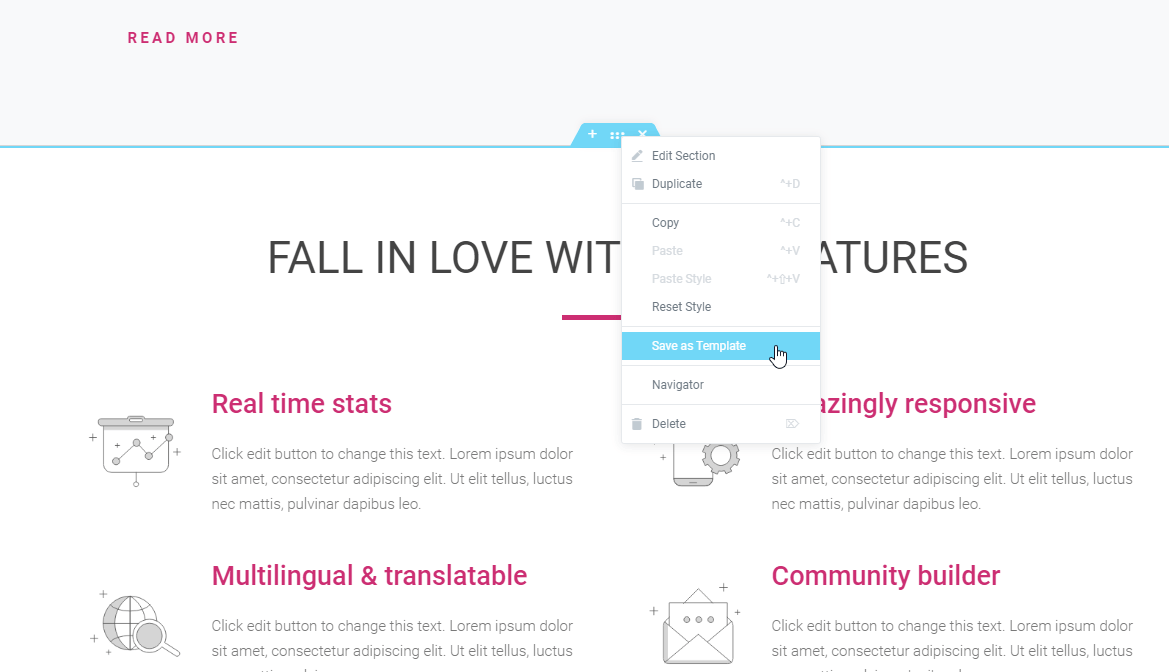
You control the section column and widgets with the handle. To edit them simply right-click the handle where you can edit, duplicate, delete, and much more.
The blue line indicates where it will be positioned when you let go you can move them around by simply dragging and dropping them.
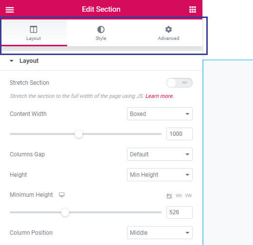
Sections, columns, and widgets have three tabs in the panel on the left. Sections and Columns have Layout, Style and Advanced tabs, whereas Widgets have Content, Style and Advanced tabs.
Next we'll see how these settings are used to create a landing page.

Adding Content, Continued
In the previous section, we learned how to get up and running with Elementor. In this section, we'll start building our page.
We can start by adding a section with one column of 100 VH (VH stands for View Height). This way the section will always take up at least a hundred percent of the screen no matter the amount of content in it. You can set the content width to 800 pixels.
The video above is from the Elementor Video Tutorial series and walks you through adding content to your landing page and styling it. Check it out, and then move on to the next section, Elementor Templates.
Working with Elementor Templates
The Elementor Template Library gives you access to over 100 designer-made page layouts, and hundreds of pre-made blocks.
Template Library
The template library is a design playground offering hundreds of preset templates and blocks. This means you have full license to use all the images for your own and your customers' websites. The library is also a space to save pages that you designed so you can reuse them again and again.
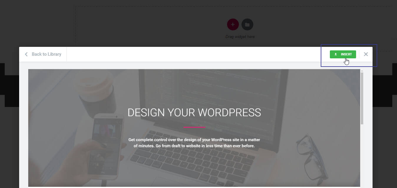
From the Editing screen click Add Template to open the library window.
This opens the library on the pages tab. On the top-left you have filters you can use to quickly locate the newest most popular and trending pre-designed templates.
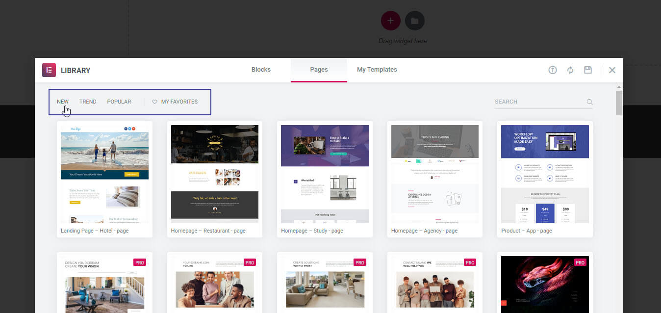
On the top right, use Search to locate a specific template. You can search by type of page, like home page, landing page, etc; the name of the template (i.e. cookie store, etc) or by tag (restaurant, art gallery, etc). If you see a template you like, mark it with a heart. That saves it under My Favorites.
Once you choose a template, insert it.
By the way, all templates are mobile responsive!
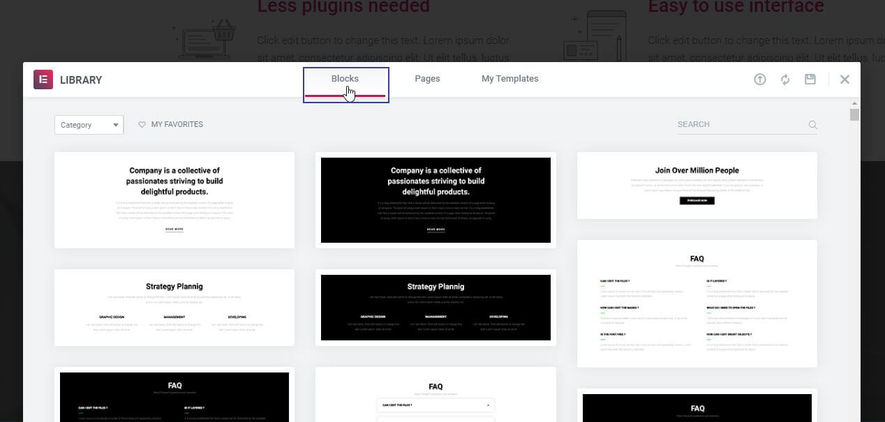
Back in the library, click on the Left tab where you can choose from a variety of standalone blocks. Blocks are pre-designed sections pre-built with widgets and layout settings that take care of your basic setup. Just customize each block to make it fit your website. You can mix and match different kinds of sections; headers, testimonials, services, forms, etc. Set them up quickly and build upon them.
Under My Templates you'll find all the pages and sections you saved as templates.
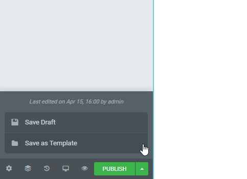
Saving a Template
Right-click the section you want to save and choose Save as Template, and give it a name.
To save an entire page, click the arrow next to publish and choose Save as Template.
If you already have a saved template, and you want to place it inside a page, use the template widget. This way you can add a template to any number of pages in your site and every time you update the template all the pages are instantly synced.
Make Your Website Responsive
Today's website visitors are more commonly using their phone to browse your website. That means to make your strongest impression your website has to look great for users on every medium, mobile, desktop, tablet and more. Use Elementor's visual Mobile Editing tools to quickly turn any page 100% mobile responsive, no coding needed.
Elementor includes five main responsive design tools. Follow the steps in the video above and you'll know how to make a 100% mobile responsive website.
Mobile Font Size
Sometimes headlines and text look great on desktop, but don't look great on a smaller screen. Switch the editor to mobile view, go to Style > Typography, and reduce the size.
Under the Content tab, you also have the option to adjust the alignment.
Reverse Columns
When you create a page with Elementor, your columns are automatically built to display on mobile. However, when you view your site on a mobile screen your columns may look different than you expected. Images may appear before text, for example. To fix this select your column, go to Section > Advanced > Responsive and turn on Reverse Columns.
Responsive Column Width
Sometimes you've created a section with more than one column side by side. When you switch to a mobile screen Elementor will automatically display them vertically. If you want to have the columns displayed side by side - but smaller - on a mobile screen, select the column, and on the Layout tab select Column Width (select Mobile) and choose 50%. Then select the next column and do the same. They should display side by side in a mobile view.
Padding and Margin
Elementor allows you to set different values for padding and margins for mobile formats. For example, a page that looks great on desktop may have too much space between the logo and the header text on mobile. To fix this, go to Advanced, find Margins, select Mobile and set the top margin to 0.
Also, a value for padding that looks great on desktop may squeeze the text too much on mobile. So go to Advanced, Padding, and select 30, for example.
Hide and Show Elements
An easy way to build assets that look great on desktop and mobile is to create a version for each, and then use the Hide function to hide certain elements on desktop or mobile. For example, create a large button that looks great on desktops, then go to Advanced > Responsive > Hide on Mobile.
Then you can do the same for the mobile version of your button. Select the button, go to Advanced > Responsive > Hide on Desktop.
Search Engine Optimization
Search Engine Optimization, or SEO, is the practice of making your site easy to find on the internet, attractive to search engines like Google, and ultimately how to get your site up there in the search rankings.
There are a number of strategies you can employ to make sure your website is easy to find and index, and the good news is that most of that functionality is already built into WordPress, the Astra theme and the Elementor editor. In fact, 90% of the technical part of SEO is going to be done automatically when you build your site.
What are some things that you should take into account when building your site?
- Is your site mobile responsive? A great thing about working with Elementor is your site is already in a format that displays well on mobile devices. This is something Google evaluates when deciding how to rank your site. You also have easy-to-use tools at hand to make sure your site looks and functions great for any screen size.
- Do you have an SSL certificate? An SSL certificate is provided free with your hosting package and should install itself automatically. Google is already ignoring sites that aren't secured, even if you don't have a shopping cart or interactive areas on your site. Site security is now a must-have, and you're already protected.
- Is your site built with elements that are readable to modern search engines? While Elementor and WordPress use a visual interface and a collection of tools to build and display your pages, they're actually building your site in HTML, CSS, and JavaScript. These are the building blocks of the internet, and it's how search engines like Google read and understand your site.
What else is there?
- Proper use of the H1 element - Google places a lot of importance on how you add your headers. Sites are often built with a collection of header types, H1 through H6. H1 is usually the biggest and boldest, all the way down to H6 which is usually small and understated. You use these headers to make titles and headers consistent throughout your site. When you put a large title element at the top of your page you should make sure it's an H1 (or Header 1).
- Alt tags for images - When you add images to your site you should add an alt description for each. This is just a brief description of what the image is. When Google evaluates your site it can't "see" the images, and when visually-impaired customers visit your site they often can't see them either, so you want to make sure there's a text description of each image for maximum readability.
- Text and content that's appropriate for your site - People used to try to trick search engines by jamming their pages with (often hidden) keywords to try to boost their search rankings. Google's ranking algorithm has grown beyond this kind of content. Now Google looks at everything on your site and builds a contextual model, and compares it to other sites like yours. This means the best way to make sure Google likes and understands your content is just to add meaningful content to your site in natural ways. If you are a business, describe your services, your hours of operation. If you are a festival, show your performers, your dates and times, and how people can sign up. Make a site that's clear to read and Google will understand it.
- Contact page with a form - It is increasingly important to have a site with a way to contact the site owner. An active contact form with an email address or form gives authority to your site and Google gives it more legitimacy. An email or phone number is ok, but you risk getting a lot of spam if you put your email address in plain text on your site. Instead, consider adding a simple form to connect to your visitors, and WordPress has built-in spam protection. Elementor provides plenty of eye-catching templates that can be easily adapted to your site.
- Geolocate yourself - If you're building a website for your business as a cobbler, you don't necessarily want to come up in search results with every other shoe-repair shop in the world. That could be thousands or millions of results. But if you add a lot of text on your website that describes your shoe repair service, how happy your customers are, and importantly where you're located Google will rank your site higher in those regions. Add a Google map and your physical address to your footer or contact page, and tell people you've been repairing shoes in Ottawa, Nepean, Orleans and the Greater Ottawa Area for 7 years, with thousands of happy customers!
- Meta tags - Meta tags are still important, and they provide a quick description of your site or page that Google will use to categorize your content. Elementor doesn't - at the time of this writing - have an easy way to add Meta Tags, but we recommend the free plugin YoastSEO to add that additional content. Yoast will also scan your site and make recommendations for ways you can improve the search engine readability of your site.
Anything else?
Above we talk about the technical parts of improving your search engine optimization, but there is more you can do to improve your search rankings. The most important thing is creating Dynamic Content. If you have the kind of site that is constantly publishing new content then Google will see your site as a place it should be referring visitors for the latest updates, news, and information.
- Blogs
- News, events and other traffic generating strategies
- Video
- Social media engagement
- Testimonials
A blog, if you keep producing new content on a regular basis, is a great way to improve your search ranking. If you have social media accounts, and you're active on those accounts, that improves your search rankings. If you have a section on your site for testimonials, or if you have a lot of reviews of your business on Google or Google Maps, that helps a lot. And video content is becoming even more important to Google. Google owns YouTube, which is the second-largest search engine on the internet. If you can create and publish short videos, hosted on YouTube and embedded on your site, you're taking advantage of both Google and YouTube search rankings.
How will Google find me?
Automatically, and it takes time. It can take a few months for Google's AI to properly contextualize your site and rank it. For a brand new site, it can take a while just to appear on Google, and if you're rebuilding a site you can actually see your ranking stay the same or even go down a bit until Google ranks you. But if you apply the above strategies you should see your site properly ranked and you have a lot of tools at hand to improve your SEO.
Revisions and Backups
No matter how careful you are, you're going to move something, or delete something, and you'll want to revert that change. WordPress has a robust revision history, and Elementor has a history function built into the editor. These protections make sure you can quickly and easily recover from a mistake and keep building without missing a beat.
If you're building a page in Elementor and you delete an element, or move something unintentionally, or make a change you're just not happy with when you're done, you can quickly revert that change by going to the History tab in the Elementor editor.
In the history, you can see each change you've made to the page during this session.
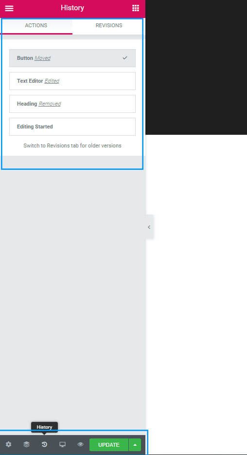
Important note: The Actions history is only what you've worked on for this session, that is from when you opened the editor until you close it or updated it. That history is not saved between updates, or after you close the window. To revert to a previous change after you have closed the sessions or the editor, you can use the Revisions tab in Elementor (see above), or the WordPress revision history.
To access the WordPress revision history you start in your WordPress dashboard, go to Pages > All Pages, and find the page you want to revert. Instead of clicking Edit with Elementor, you just want to click Edit.
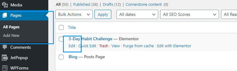
On the right you'll see Revisions, click that.
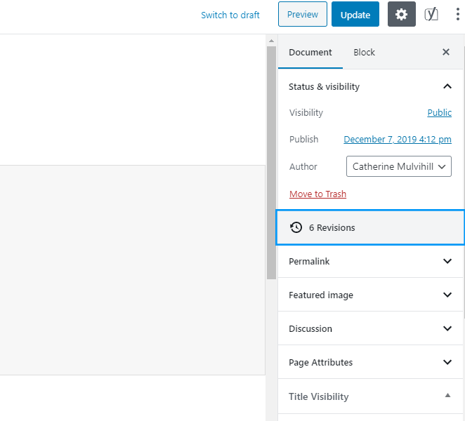
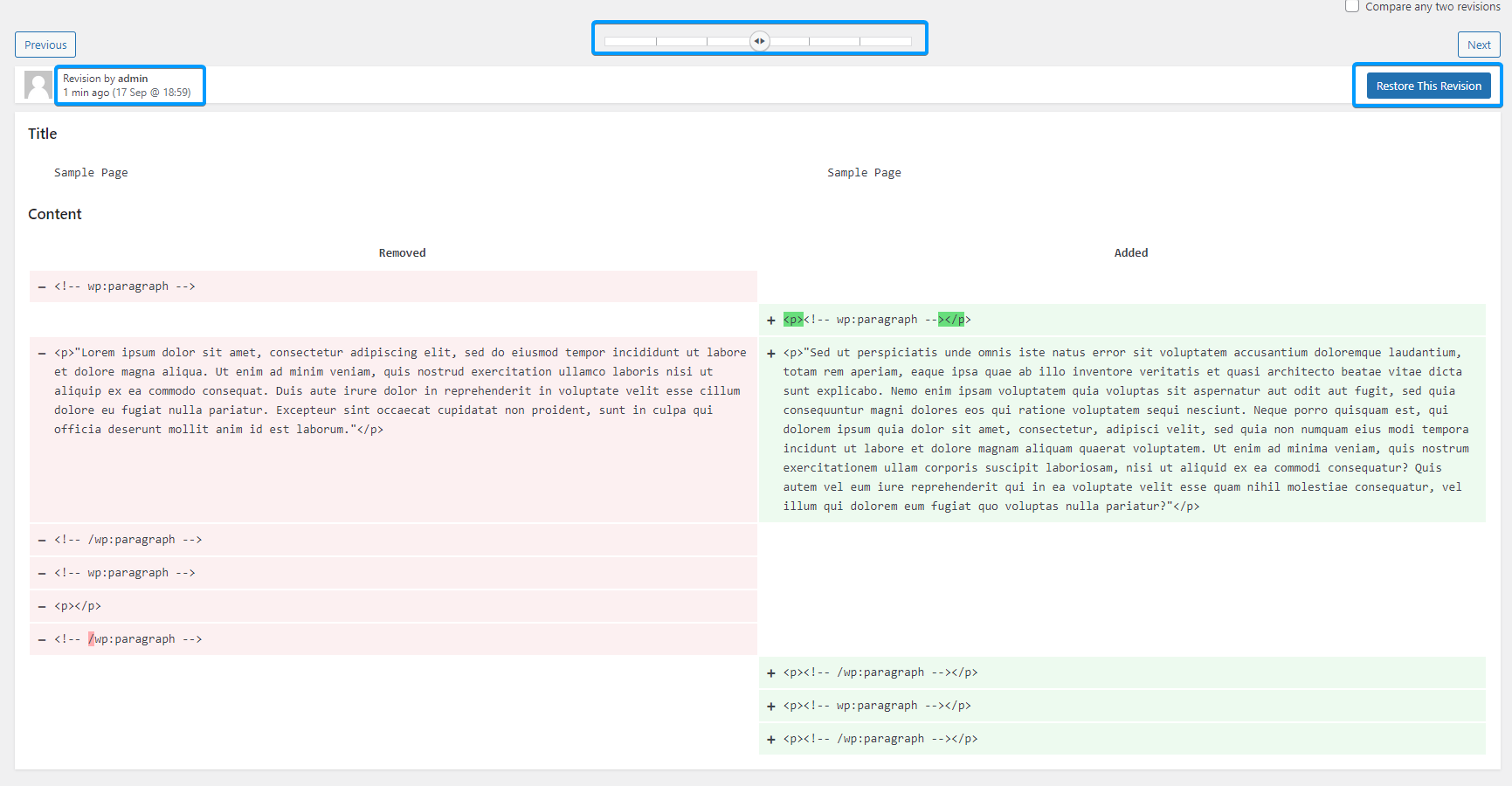
That will open an editor that lets you select which revision you want to revert to, and it will show you the changes in the code for that revision, and the date on which the revision was created. An iteration of your page that you can revert to is created every time you publish your changes in Elementor, that is when you click Update.
Rebel Website Design
Hopefully, we've given you the tools you'll need to start your own website. Beyond this guide there are free resources online that will help you take the next step. With a little time, some planning and some effort, you can put together a terrific, professional-looking website.
If you've tried this guide and decided web design isn't for you, we'd be happy to hook you up with one of our Website Design partners.


